


Piaoan Group's logo and packaging have been upgraded
- Categories:Group dynamics
- Author:
- Origin:
- Time of issue:2022-10-27 10:45
- Views:0
Piaoan Group's logo and packaging have been upgraded
In order to further enhance the company's brand image and improve the brand recognition of Piaoan. Shaping a unified packaging system to better reflect the company's industry status. Our company entrusts Dongdao Brand Creative Group Co., Ltd. to carry out logo optimization and product packaging upgrade design.
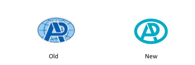
By adjusting the proportional structure, simplifying details, and changing colors, the original logo has been inherited and optimized, becoming more concise, modern and beautiful. In the optimized logo, the ellipse in the outer circle represents the world, symbolizing the corporate vision of Piaoan's brand and products crossing the ocean to win world recognition. The cross shape in the circle represents the English abbreviation "PA" of Piaoan, which means the stability and safety of Piaoan products. The color of Piaoan Blue reflects the characteristics of the medical industry.
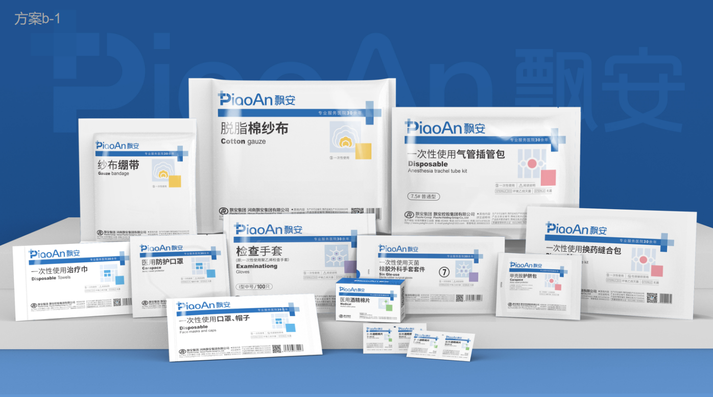
New Packaging
The new packaging system consists of brand area, product information area, key information area and symbol labeling area. Drawing on the experience of well-known brands in the same industry at home and abroad, it also reflects the sales characteristics of Piaoan Group mainly in the medical field and the advantages of professional service hospitals for more than 30 years. Compared with the original packaging system, it is more beautiful, unified and professional, which can further enhance the brand image and market awareness of Piaoan.
About piaoan | News | Products | Careers | Contact us
Copyright © 2020 Henan Piaoan Group Co., Ltd. Porwer by www.300.cn
Copyright © 2020 Henan Piaoan Group Co., Ltd.

Scan the code to follow us